We all know that Steem is amazing, it’s much more than just a blogging platform, you can make vlogs, playing games, all kinds of stuff. We have that many tribes and communities!
But,
Most used user interface on Steem is still steemit.com, which, to be honest, isn’t that amazing.
I’ve tried a few front ends on Steem already, some are cooler than others, I like some better than other, but what I was thinking about is a more integrated profile page like below:
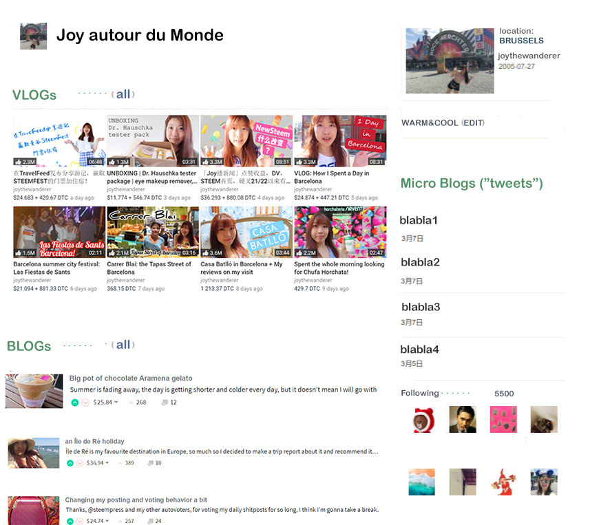
Since we have dtube, 3speak, we have travelfeed, and many other apps. I like their interfaces quite well and use them to post on Steem blockchain sometimes.
But so far I haven’t seen any front end that can integrate all these functions together.
I’m no UI/UX specialist but I meant something like this:
Different blocks show different sections and users can customised their own priorities by dragging each section to the position they want to place on the page.
For example, if I’m more of a vlogger, I would want my page to be shown as above, with my vlogs on the top.
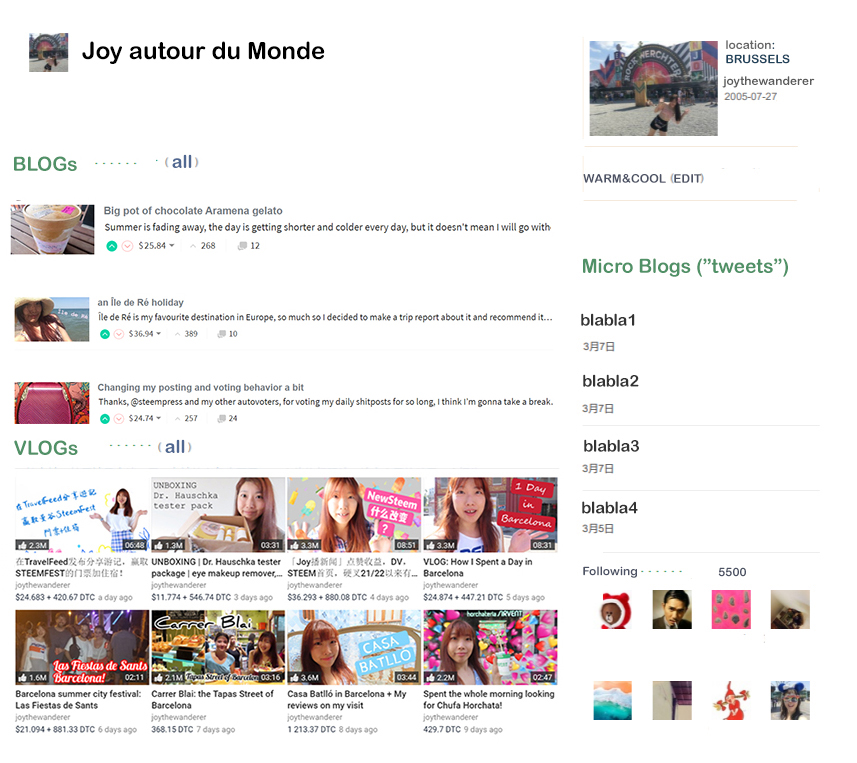
If I’m more of a blogger, I would show my blogs on top.
Of course, many other apps can be added as movable sections on the page, such as your SPT games, your tribes.
Also tags can be added somewhere you want on your page, for easier search.
![]()
What do you think? I think it would be better than everything shown as a post like steemit.com.
But again, I’m no expert in UI/UX, I don’t know how difficult to archive such.
Thanks for reading.
If you like my post, feel free to follow @joythewanderer
![]()

